고정 헤더 영역
상세 컨텐츠
본문
1. 배경
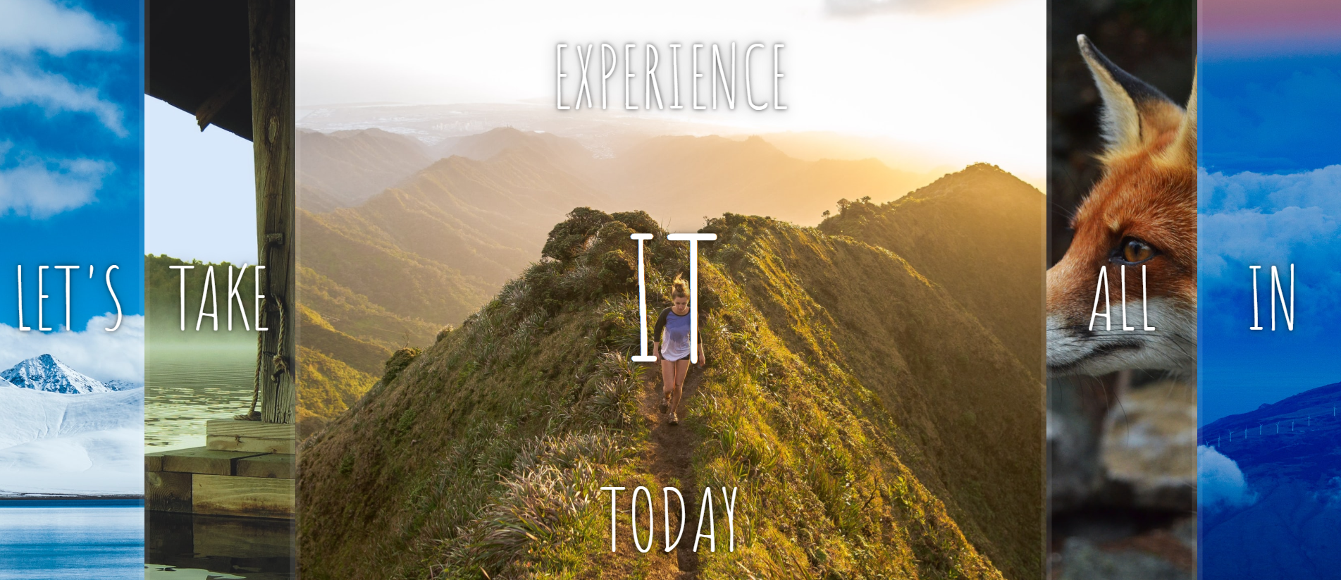
복수의 사진을 띄우고, 사진을 클릭하면 사진이 확대되면서 위아래에 숨겨진 단어가 드러나도록 하였다.
2. HTML
<!DOCTYPE html>
<html lang="en">
<head>
  <meta charset="UTF-8">
  <title>Flex Panels 💪</title>
  <link href='https://fonts.googleapis.com/css?family=Amatic+SC' rel='stylesheet' type='text/css'>
</head>
<body>

  <div class="panels">
    <div class="panel panel1">
      <p>Hey</p>
      <p>Let's</p>
      <p>Dance</p>
    </div>
    <div class="panel panel2">
      <p>Give</p>
      <p>Take</p>
      <p>Receive</p>
    </div>
    <div class="panel panel3">
      <p>Experience</p>
      <p>It</p>
      <p>Today</p>
    </div>
    <div class="panel panel4">
      <p>Give</p>
      <p>All</p>
      <p>You can</p>
    </div>
    <div class="panel panel5">
      <p>Life</p>
      <p>In</p>
      <p>Motion</p>
    </div>
  </div>

</body>
</html>
html은 위와 같이 단순하다. 다섯 개의 그림을 담을 부모 div가 하나 있고, 각각 그림 및 단어를 담을 자식 div가 있다.
3. CSS
    html {
      box-sizing: border-box;
      background: #ffc600;
      font-family: 'helvetica neue';
      font-size: 20px;
      font-weight: 200;
    }

    body {
      margin: 0;
    }

    *, *:before, *:after {
      box-sizing: inherit;
    }

    .panels {
      min-height: 100vh;
      overflow: hidden;
      display: flex;
    }

    .panel {
      background: #6B0F9C;
      box-shadow: inset 0 0 0 5px rgba(255,255,255,0.1);
      color: white;
      text-align: center;
      align-items: center;
      /* Safari transitionend event.propertyName === flex */
      /* Chrome + FF transitionend event.propertyName === flex-grow */
      transition:
        font-size 0.7s cubic-bezier(0.61,-0.19, 0.7,-0.11),
        flex 0.7s cubic-bezier(0.61,-0.19, 0.7,-0.11),
        background 0.2s;
      font-size: 20px;
      background-size: cover;
      background-position: center;
      flex: 1;
      justify-content: center;
      display: flex;
      flex-direction: column;
    }

    .panel1 { background-image:url(https://source.unsplash.com/gYl-UtwNg_I/1500x1500); }
    .panel2 { background-image:url(https://source.unsplash.com/rFKUFzjPYiQ/1500x1500); }
    .panel3 { background-image:url(https://images.unsplash.com/photo-1465188162913-8fb5709d6d57?ixlib=rb-0.3.5&q=80&fm=jpg&crop=faces&cs=tinysrgb&w=1500&h=1500&fit=crop&s=967e8a713a4e395260793fc8c802901d); }
    .panel4 { background-image:url(https://source.unsplash.com/ITjiVXcwVng/1500x1500); }
    .panel5 { background-image:url(https://source.unsplash.com/3MNzGlQM7qs/1500x1500); }

    /* Flex Children */
    .panel > * {
      margin: 0;
      width: 100%;
      transition: transform 0.5s;
      flex: 1 0 auto;
      display: flex;
      justify-content: center;
      align-items: center;
    }

    .panel > *:first-child {
      transform: translateY(-100%);
    }
    .panel.open-active > *:first-child {
      transform: translateY(0);
    }
    .panel > *:last-child {
      transform: translateY(100%);
    }
    .panel.open-active > *:last-child {
      transform: translateY(0);
    }

    .panel p {
      text-transform: uppercase;
      font-family: 'Amatic SC', cursive;
      text-shadow: 0 0 4px rgba(0, 0, 0, 0.72), 0 0 14px rgba(0, 0, 0, 0.45);
      font-size: 2em;
    }

    .panel p:nth-child(2) {
      font-size: 4em;
    }

    .panel.open {
      flex: 5;
      font-size: 40px;
    }
CSS에서, :first-child와 :last-child는 각각 형제 엘리먼트 중 첫 번째 엘리먼트와 마지막 엘리먼트를 의미한다. 즉,
.panel > *:first-child는, panel 클래스를 가지는 앨리먼트의 모든 자녀 앨리먼트 중, 첫 번째 앨리먼트, <p>Hey</p>, <p>Give</p> 등이 되겠다. 여기에 translateY를 -100%로 줘서 화면의 위쪽으로 보이지 않게 재배치하고, .panel > *:last-child는 translateY를 100%로 줘서 화면의 아래쪽으로 보이지 않게 재배치한다.
또, .open-active 클래스가 추가되었을 때는, first-child와 last-child의 translateY를 0으로 만들어 원래 위치로 되돌아오도록 하였다.
4. Javascript
    const panels = document.querySelectorAll('.panel');

    function toggleOpen() {
      this.classList.toggle('open');
    }

    function toggleActive(e) {
      console.log(e.propertyName);
      if (e.propertyName.includes('flex')) {
        this.classList.toggle('open-active');
      }
    }

    panels.forEach(panel => panel.addEventListener('click', toggleOpen));
    panels.forEach(panel => panel.addEventListener('transitionend', toggleActive));
먼저, panels 변수를 만들고, panel 클래스를 가지는 HTML 태그들을 querySelectorAll로 Nodelist로 반환받는다. 이 Nodelist의 모든 요소에 대해, 클릭되었을 때 toggleOpen 함수를 실행시키도록 이벤트 리스너를 추가한다. toggleOpen 함수는 호출 시점에서 실행하는 함수가 가리키는 객체, 즉 클릭된 HTML 태그에 대해 classList.toggle을 실행하게 된다. classList.toggle(string)은 클래스가 존재하면 제거하여 false를 반환하고, 존재하지 않으면 클래스를 추가하여 true를 반환한다. 이를 통해 클릭된 HTML의 panel들은 open 클래스를 가지거나 제거하게 될 것이다. .panel.open은 flex를 5로 변경하여 해당 사진이 화면에서 차지하는 비중을 높이고, 폰트 사이즈도 확대하여 강조되도록 하였다.
또, 마찬가지로 모든 Nodelist의 요소들에 대해, 트랜지션이 끝났을 때 toggleActive 함수를 콜백하도록 할 것이다. toggleActive 함수는 해당 이벤트의 propertyName이 'flex'라는 문자열을 포함하고 있는 경우에 open-active 클래스를 추가하거나 제거하게 될 것이다.
여기서 주의할 점은, this 대신 eventTarget을 이용하면, panel 클래스를 가진 div가 선택되지 않고, 실제로 선택된 태그, 이를테면 panel 클래스를 가진 div의 하위 태그인 p 태그가 선택되기 때문에 코드가 실행되지 않는다. this는 이벤트 리스너가 부여된 대상, 즉 각각의 panel 클래스를 가진 div가 된다.
같은 이유로, 위 코드는 이벤트 위임을 이용할 수 없다.
※ eventTarget는 실제로 클릭된 요소, eventCurrentTarget은 이벤트 리스너를 부여한 대상이다.
※ 이벤트 위임(delegation)은 상위 요소에 발생시킨 이벤트가 하위 요소에서도 발생하도록 하는 것이다. 반대로 이벤트 버블링(bubbling)은 하위 요소에 발생시킨 이벤트가 상위 요소에서도 발생하도록 하는 것이다.
'Experience > [Javascript] JS 30' 카테고리의 다른 글
| [Javascript] 07. Array Cardio Day 2 (0) | 2021.04.18 |
|---|---|
| [Javascript] 06. Ajax Type Ahead (0) | 2021.04.17 |
| [Javascript] 04. Array Cardio Day 1 (0) | 2021.04.15 |
| [Javascript] 03. Update CSS Variables with JS (0) | 2021.04.14 |
| [Javascript] 02. CSS + JS Clock (0) | 2021.04.12 |


댓글 영역